COLOR THEORY & INTERACTION
FOUN 106
PROJECT 1: VALUE EMPHASIS STUDIES
Linear, radial, central, grid, and cluster spatial organizations are represented by the collages below. There are two collages per spatial organization and each has its own focal point. Magazines were used to create texture and emphasize the spatial organization.


10
Pure black
9
8
7

6
5
4
3
2
1
Pure white
A value strip was created to help visualize the values of colors and control the mixing of white and black to create achromatic grays. Starting with pure white, black was mixed gradually until the mixture was pure black.
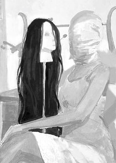
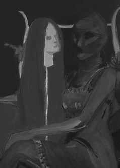
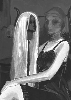
A photo was selected to duplicate in different overall values. High key value with a low value focal point, a low key value with two high key focal points, and a mid-value with two high key focal points.

PROJECT 2: THE COLOR WHEEL
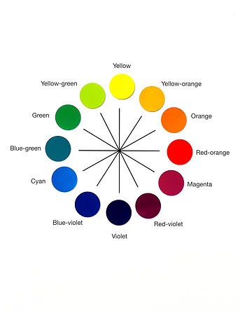
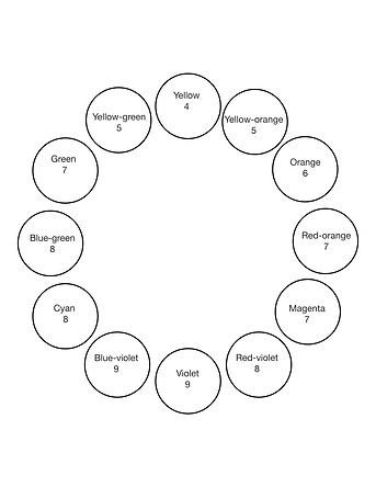
Through mixing cyan, magenta, and yellow gouache paints, a 12-hue color wheel was created based on Johannes Itten. Using the value ruler above, a value was assigned to each prismatic color on the wheel.
The color wheel is a useful tool to create palettes based on hue: analogous, triadic, complementary, split-complementary, primary, and secondary are some examples.
PROJECT 3:
BEGINNING COLOR STUDIES
The same composition was used to demonstrate different palettes. In addition, complementary colors were used to demonstrate their properties such as vibrating when next to each other, and creating chromatic grays when mixed.

Wide range hue
Wide range value

Wide range hue
Narrow range value

Split complementary
Yellow green, magenta, violet

Blue and orange transition

Complementary

Chromatic gray
PROJECT 4: ANALOGOUS
AND BEZOLD WEAVINGS
This project illustrates the Bezold Effect; how the overall look of a palette can completely change by just replacing one color. This is exemplified by the analogous weaving and replacing red-orange with its complement blue-green.


PROJECT 5:
THE INTERACTION OF COLOR
This project explored the interactions between colors, and how the surrounding colors affect its appearance. It also focused on illusions, such as making the same color appear different and alluding to transparency.


PROJECT 6: THE LIGHT PROJECT
Unlike the previous projects dealing with subtractive color, this project deals with additive color. For this project, the concept was astrology. Paper was cut in the shape of a Capricorn to use light and shadows to see their relationships. In the left example, green, red, and blue light were used. The shadows created from
the paper cutout combined to create magenta and yellow, and the light combined to create a white color in the background. The yellow and magenta combined to form red. In the right example, red is used to symbolize a garnet gemstone, while the left represents Saturn.


PROJECT 7: PROPORTIONAL COLOR INVENTORIES
A painting was chosen to analyze the ratio of colors and apply it to a new piece. In addition, the colors were matched through subtractive color mixing, and using the results to recreate the original piece from paper cutouts.


PROJECT 8: POP UP BOOK
The goal for this project was to use color palettes in three dimensions. The concept was to showcase different events in life that lead to financial troubles and its effects on mental states. Click on an image below to view the reasoning behind each color palettes and underlying narrative, while the video shows the interactive aspects.


